touch & feel, v12

happy wednesday, you. hope you’re doing well and incrementally improving. i have a couple of updates to share.
the first — the here cam app you all helped me shape has been out in the app store for 2 weeks now!! this past sunday i added the ability to share photos. it supports sharing straight to instagram stories as well as to the share sheet on your phone. so far it’s been tapped 152 times and photos have been shared to instagram stories 21 times. the numbers aren’t enterprise level but fun to track regardless. here’s that share experience…

the second update — i’ve been thinking about what to explore next and decided to pause the actual what for the why and where (thanks for the nudge, marc). i love finding opportunities to design and build products but i need to define in which direction i want to build in.
the trajectory is east bound. the closest collection of products i seek to be in the company of conveniently live in one book. about three years ago, i picked up a remarkable little gem from a sweet book store on avenue a in new york, mast books, and the book was called “hidden-unveiling japanese design”. the book gathers some of the most thoughtful physical products that i have ever encountered. the curation was done by the brilliant oki sato of nendo.
he rounds up products into three different categories — behind, before, and inside. the behind category shows exceptional products that add unexpected thoughtful functionality either on the behind, back side, or bottom. the inside category shows products adding functionality to the inside. the before category rounds up products that add functionality that is revealed through time. what makes these products exceptional is their layered thoughtfulness. they take responsibility beyond the point in time that the product usually helps you in.
example 1, behind, the carry stool by ishinomaki laboratories
the stool serves as a stool but also has a tray function to help you carry anything you’d like to transport wherever you’ll be setting the stool down for a seat.

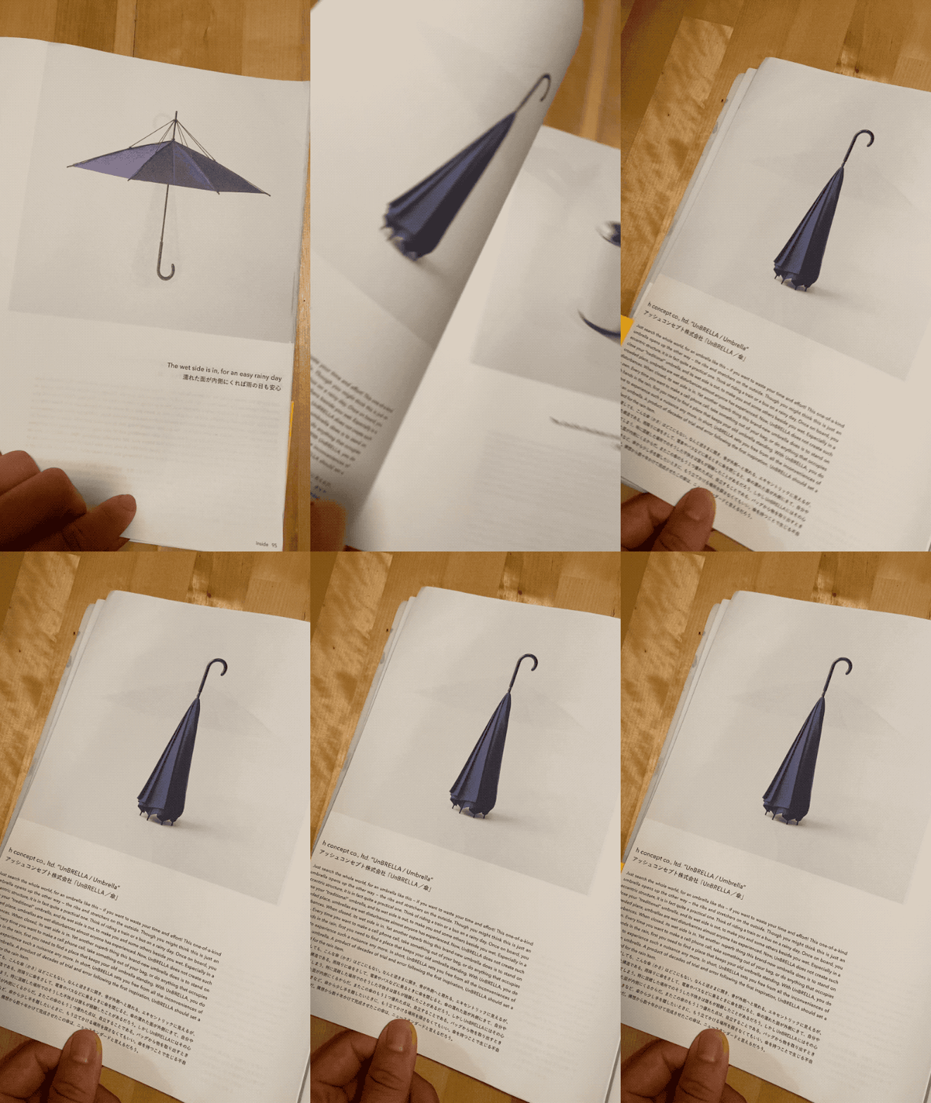
example 2, inside, the unbrella by h concept
the umbrella serves as the classic shield from the elements as well as collapses in a way that it stands with the wet side in. this way it’s easy to dock for drying after use and prevents anything that contacts it from getting wet.

example 3, before, the gold wedding ring by deux poissons
the wedding ring is 18k gold with a silver coating. as the wedding ring is worn, the silver coating fades to reveal the gold core, the passage of time.

i will pair the things i build next to these examples and use them to evaluate my output. in the beginning the gulf will be significant but i’m determined to narrow it. please hold me accountable as i share my software interpretation of these type of products. as always, thank you for your time and the continued conversations via email.
with direction and purpose,
hoyd